I see! I didn’t know that… interesting… so you like to see more details with a bright image
End of the day, as long as you are happy with how you are seeing it on screen, that’s what matters!
I see! I didn’t know that… interesting… so you like to see more details with a bright image
End of the day, as long as you are happy with how you are seeing it on screen, that’s what matters!
The hair on the reference 20th Century Fox shot seems much less red than any of our pictures, so I went through the thread looking for the least red hair. They are from my 2016 Samsung TV and Bryan’s SDR monitor. Interestingly the green on the Samsung TV looks closest to the 20th CF tone wise. As I mentioned before, this Samsung TV only reaches 65% of DCI P3
20th Century Fox ![]()
I don’t necessarily like to see more, but if one didn’t know better, one would choose the image with the most pop. Brightness, contrast are all things we gravitate to.
The processors like Lumagen and MadVR don’t have any intelligence to the creators intent. They just try to make the image that their creators think people like the best.
Below is the Lumagen version ![]() (resized it to fit Desray’s guidelines). It’s also brighter than the reference
(resized it to fit Desray’s guidelines). It’s also brighter than the reference
That’s a good exercise, we all learn something new now…
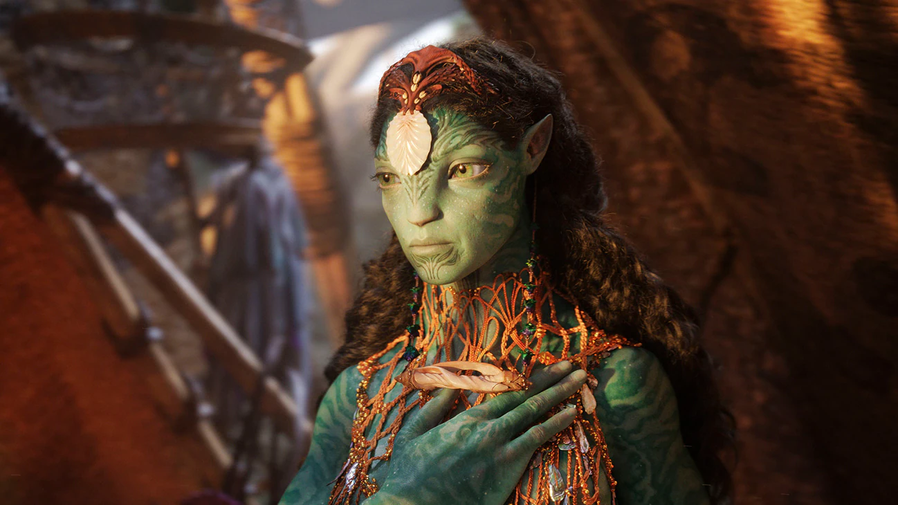
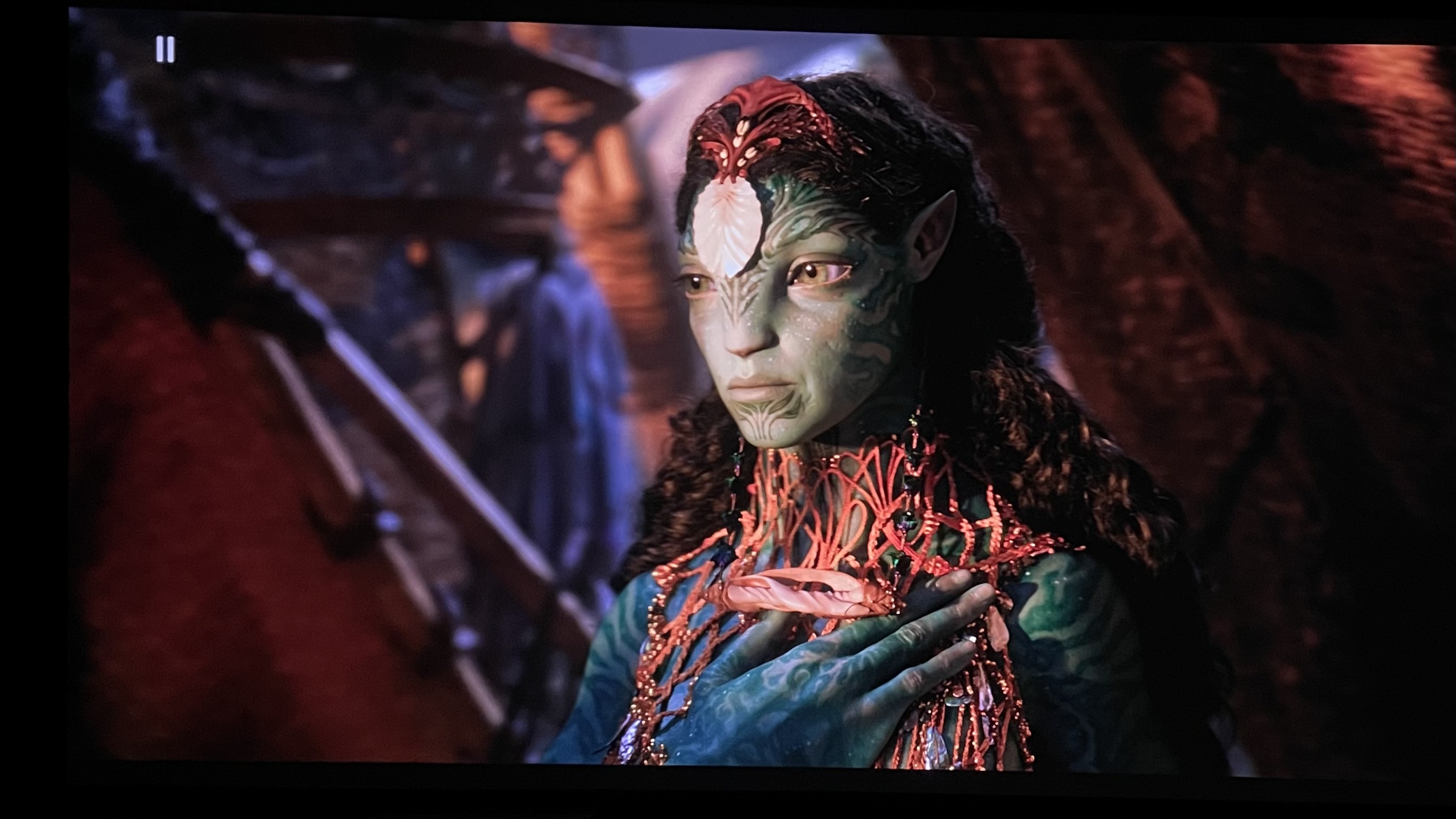
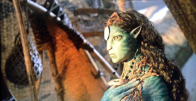
If we cut out the image and have a close look, we can see the shapes and lines of the shell clearly, and also her accessories the stone is dark green in colour. We can see the tiny dots of sparkle on her face and her eyes are more green than yellow on this image…
Similar sparkles can be seen on her hands . The colours of her necklace looks more like “rust” colour; a combination of orange and brown
Tattoos on her chin is black and on her side face is dark green…her locks are in mahogany brown and slight red above her forehead…
Wow… all the doubts cleared ! Lol
What a fruitful exercise …
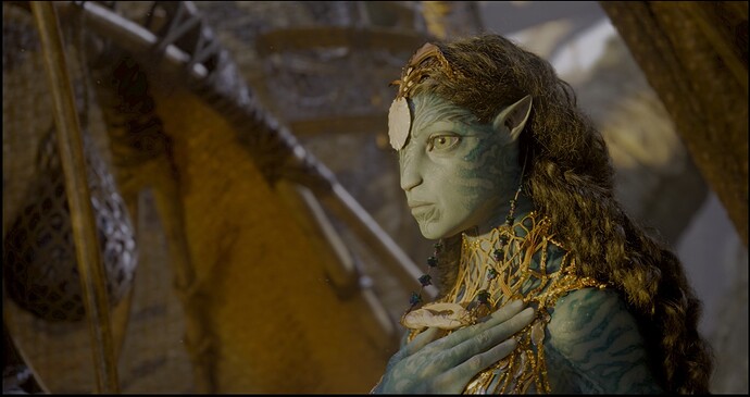
One the green versus yellow eyes, its a different angle than any of us managed to capture, so she is facing the sunlight more in our shots versus the reference.
But the largest difference to me is the color of the hair. Except for the SDR or close to SDR displays, its generally much much redder in all the shots.
So the doubt remains as to whether the HDR-X file we used was what 20th Century Fox used when they produced those images ![]()
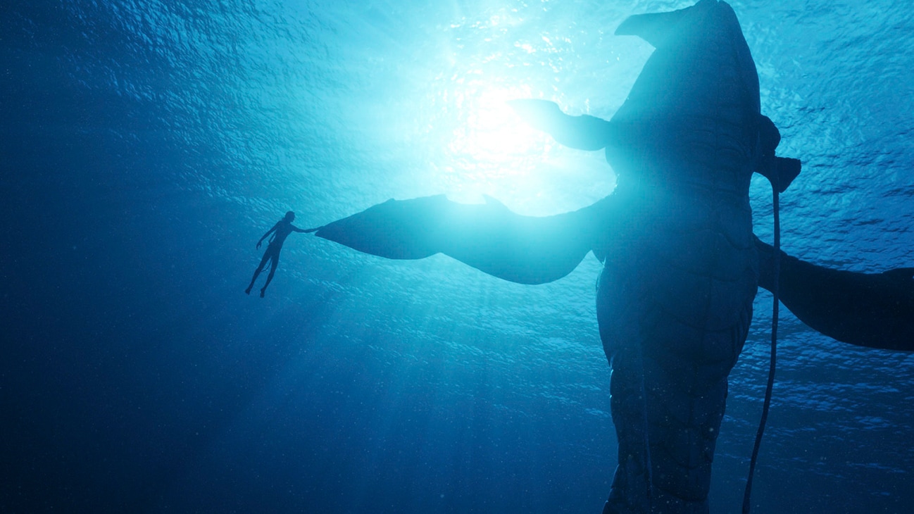
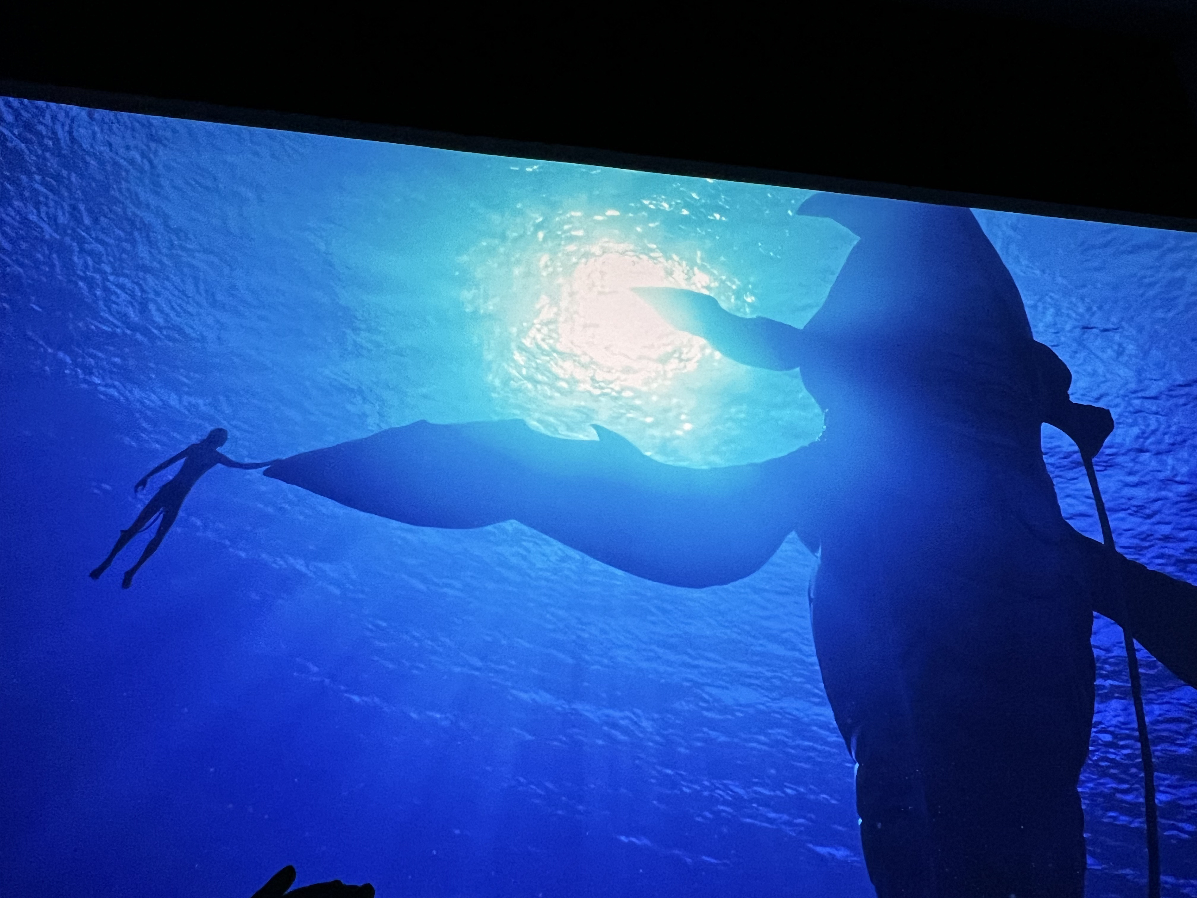
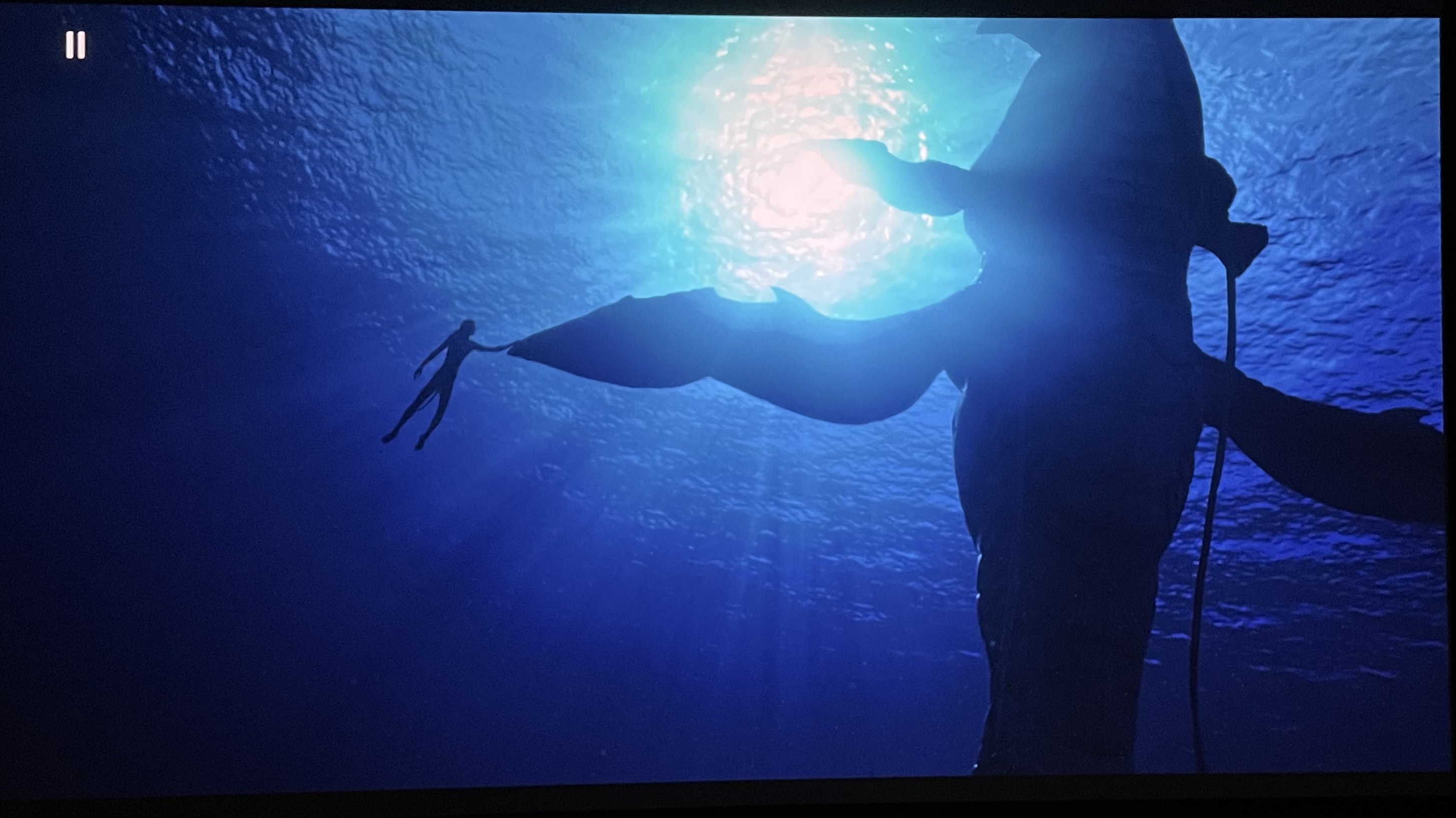
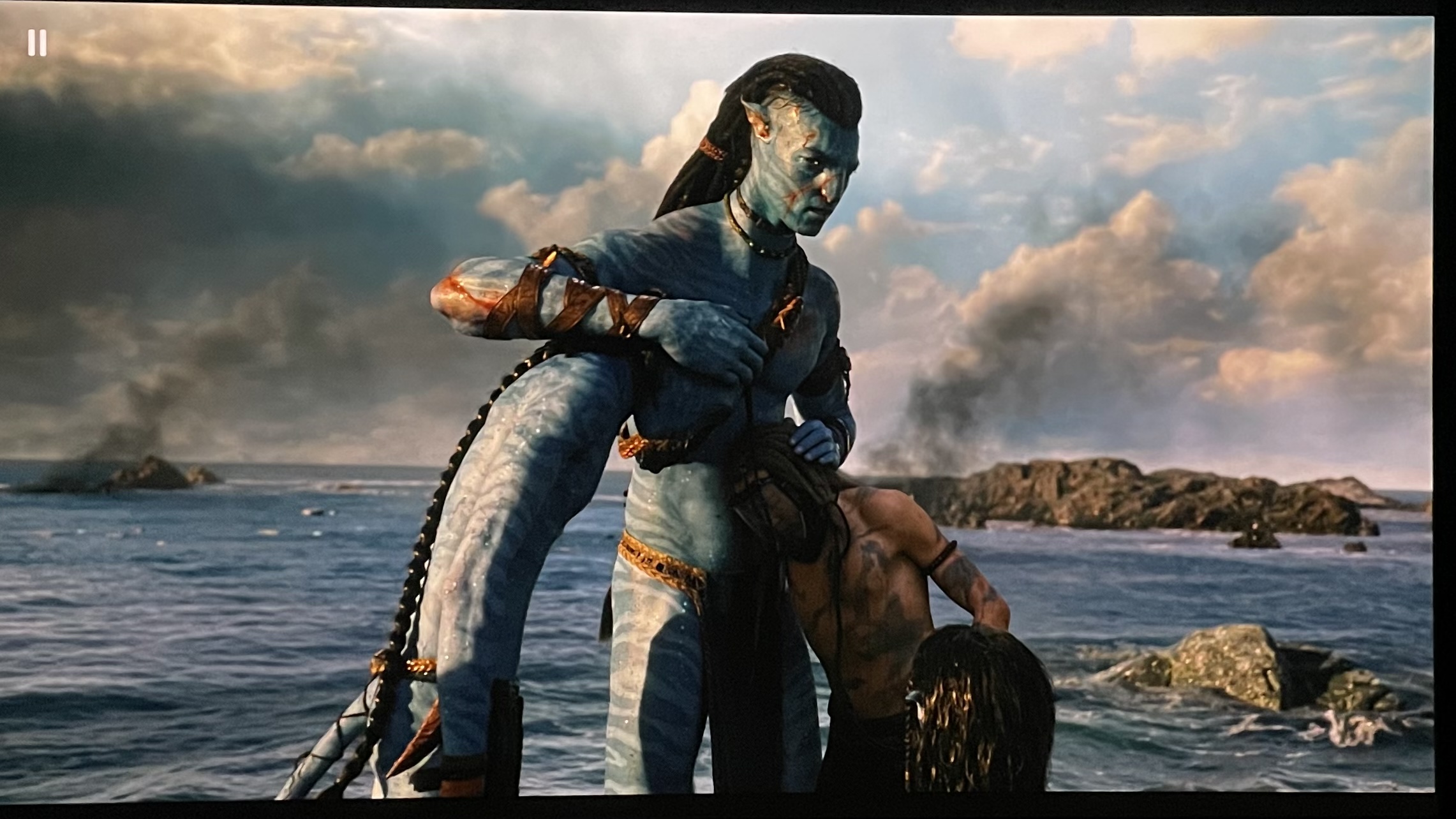
This is another fantastic image to test the tone mapping of your projector , avatar whale scene … also from 20th Century studios…
If the tone mapping is not good enough, the light section will look blown…
Very nice you can see the details clearly… the ray of light shining through the waters…
I like it when the video shows up like the above
Well done…you have just introduced another factor into consideration - i.e. the HDR colorist for the HDR-X trailer provided by Roni.
This thread which is supposed to talk about the movie, Avatar the way of water has now become the de facto thread for evaluating HDR tone-mapping of different display. ![]()
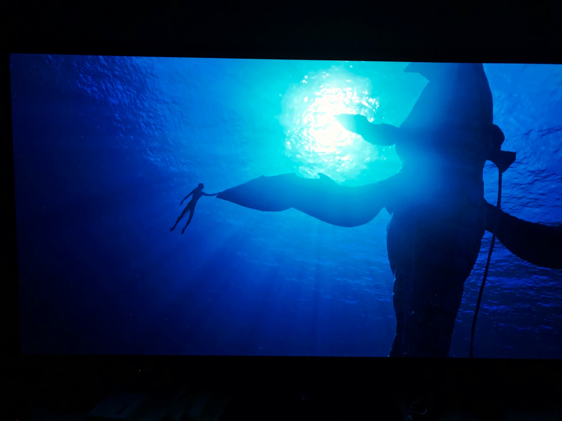
Here is the 20th Century Fox swimming scene, next to MadVR’s version of it. Like the flames in the other shot, MadVR goes a little nuts in extracting detail from bright parts, while keeping the luminance on other parts
Highlights and shadow details, MadVR have no problem imo displaying on a capable display. The difference in blue is pretty strong. Is the above image in HDR or SDR?
It’s the HDR-X file direct from Youtube over a Firestick Max. I think Foodie and I established that the difference in colors could be the camera or the calibration
So, this is the shot from my Panasonic OLED which has no MadVR. MadVR makes the projector look like the OLED, colors not withstanding… In fact, I’d probably say MadVR might have better detail than the OLED, but then it could be the camera. It could also be that MadVR managed to fit everything into the 47 maximum nits that my LG can produce calibrated. Whereas, my iPhone camera is simply not able to capture the 700 nit dynamic range of the OLED.
The key thing is watch it on your own display and see if you can see the detail that is not in the 20th Century Fox shot.
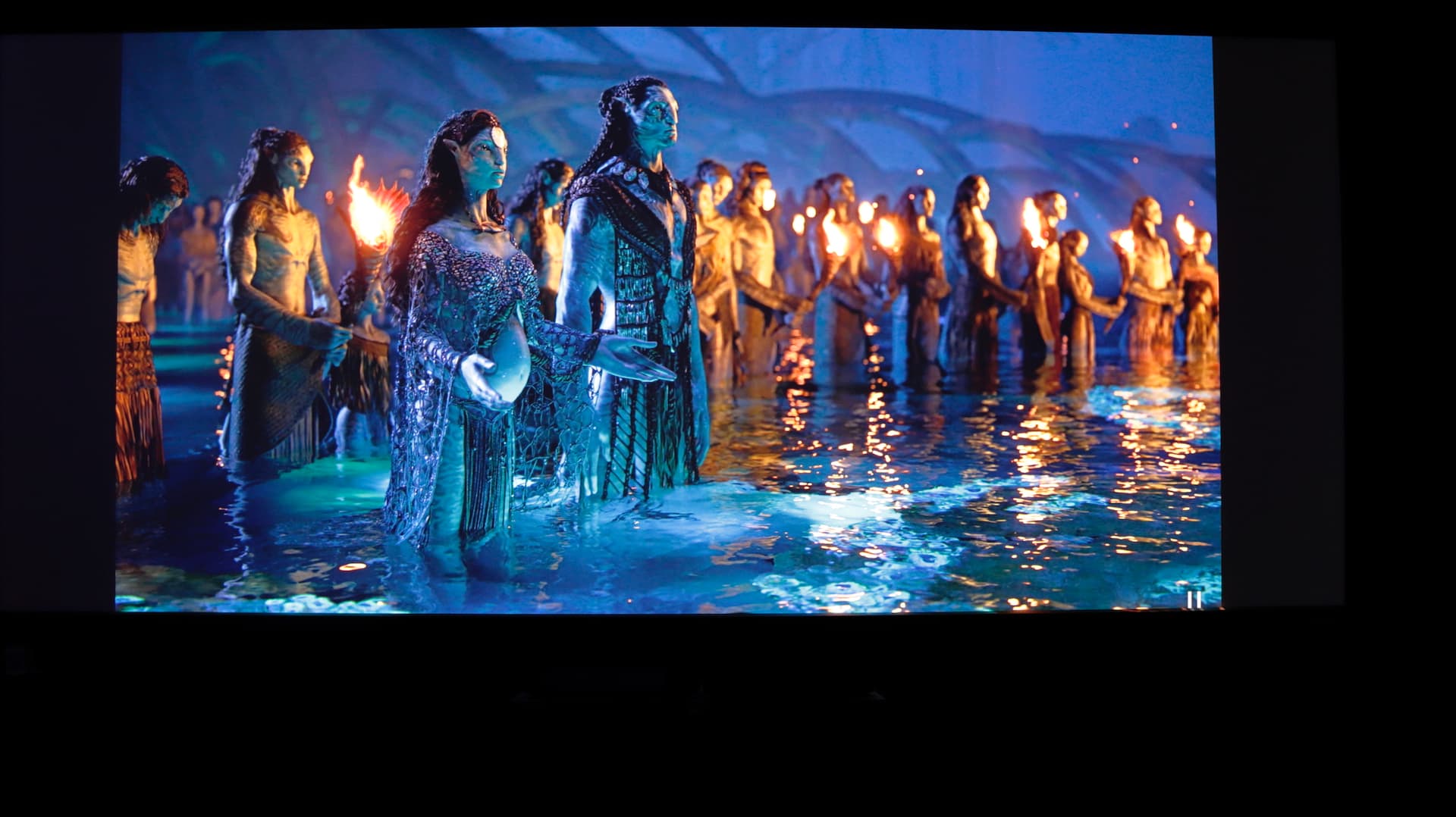
Hahahaha… no choice, james Cameron’s movies are just too good ! Lol ![]() reference for video
reference for video
I just tried to compare the video… I think Sammy is right, the hdr -x version we use has a bit more depth to the colours
Century reference above ![]()
Lg tone mapped with hdr-x source
Century studios reference ![]()
On hdr-x Lg above
Century studios ![]()
Lg hdr-x above
I can see there is so much more depth in blue and green on the hdr-x copy…
This is the other scene …
This avatar movie is the reference !
All the calibration flaws, pros and cons can be seen on this movie… and even the source file, or HDR-X changes how the video looks on screen…
Wow I just love the video and colours on this movie, so nice there are so many things u can see on screen…
I think the blue has so much more depth on the HDR-x version that the ocean looks more blue than green …. we can see the clear difference in that whale scene
We might need to check this on the normal HDR10+ or DV file when it’s released … to see if the colours track more closely to what we are seeing on the 20th century studios version
On your last scene where we were discussing the sky earlier, LG DTM does a good job with the sky i.e., bright images, but it tends to apply more than MadVR to the whole frame rather than a small area. Hence sometimes, shadow details disappear. Also LG DTM does not boost the details from dark scenes. Its more one dimensional in processing overly bright highlights to prevent clipping.
Ya I see all your points, this is a good exercise IMO… we all get to see the different versions from different calibration with different source and then comparing against the reference version from 20th century studios
I was actually looking for the colour temperature setting on the Lg, but later found out that there were no such options when it kicks in to hdr mode…
Avatar 2 will be like another reference video . Like the first one we use it for 3D on one particular scene .
Nice
Personally i like the hdrx version with the higher depth ![]() Great job by the person who did the color re-grading.
Great job by the person who did the color re-grading.